1.3.1.1. Results View - Picture Box
By default, the Search Results show up in the last view style that the user used, but it is a quick and single click on the View Toggle button to bring them up in the alternate view. Needless to say, only the way the results are displayed differs, the products that came up in the Search do not.
The results list is not paginated. Instead, for even more ease of use, the user has to just simply keep scrolling, and more products meeting the search filters will be loaded as needed.
 Application
Back ButtonThis is the position of the Back Button for this application. No matter what image may be displayed, it always overlays the Back button when in this position.
Users are strongly advised to use only this to step back through the online ordering system, and not use the browser's back button.
|
 Product Filters &
Extended SearchA quick glance at here allows the user to see exactly what filters they have picked thus far, and clicking on it opens up the filter menu to allow the user specify the extended filters that should apply to the current Search Results, to have precise control over what they want to see.
|
 Page Tips (Help)Help on how best to use this screen.
|
 Product In CartSelected items show a small overlaid Cart Icon, with a number beside it that indicates the count of trays in the user's cart.
|
 Cart View ButtonThis switches to the current contents of the user's cart.
|
 Results View ToggleToggles view of search results between Picture Box and Text Grid.
|
 Application Menu
Open/Close ButtonOpens and closes the short menu of links back and forth to important pages on this web site. The items for this screen are:
Filters  (same as the Product Filters button) Order Online  View Cart  Order History  Log out
User Manual  |
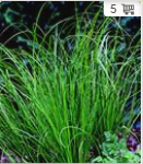
 Product PictureAs part of the Picture Box display, shows the product picture, quality, availability, container size, container type and other indicators, as well as buttons to show detailed information about the product, and to add the product to the cart. Double-clicking on the product picture is another way to open up its detail window as well.
|
 Quality IndicatorShows whether the product is of standard or premium quality.
|
 Add To Cart ButtonAdds the product to the cart. Repeated clicking of the Add to Cart button increases the count of trays added to the user's cart.
|
 Product NameThe name of the product is superimposed upon its picture on screen.
|
 Product StateThis shows the state of the product at the moment - whether it is green, or flowering, or in pollination, et cetera.
|
 AvailabilityAvailability indicator.
|
 Container SizeContainer type and size indicator. This depends on the search that was run to get these results.
|
 Product Details ButtonThrows up a window with detailed information about the plant, including factors like hardiness, sun- or shade-loving, typical full height when mature, et cetera.
|
|

