By default, the Search Results show up in the last view style that the user used, but it is a quick and single click on the View Toggle button to bring them up in the alternate view. Needless to say, only the way the results are displayed differs, the products that came up in the Search do not.
The results list is not paginated. Instead, for even more ease of use, the user has to just simply keep scrolling, and more products meeting the search filters will be loaded as needed.
Application
Back Button
This is the position of the Back Button for this application. No matter what image may be displayed, it always overlays the Back button when in this position.
Users are strongly advised to use only this to step back through the online ordering system, and not use the browser's back button.
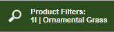
A quick glance at here allows the user to see exactly what filters they have picked thus far, and clicking on it opens up the filter menu to allow the user specify the extended filters that should apply to the current Search Results, to have precise control over what they want to see.
As part of the Picture Box display, shows the product picture, quality, availability, container size, container type and other indicators, as well as buttons to show detailed information about the product, and to add the product to the cart. Double-clicking on the product picture is another way to open up its detail window as well.
Throws up a window with detailed information about the plant, including factors like hardiness, sun- or shade-loving, typical full height when mature, et cetera.


